“A collection of personal projects ranging from mock magazine layouts, stamps, posters, and product designs.”
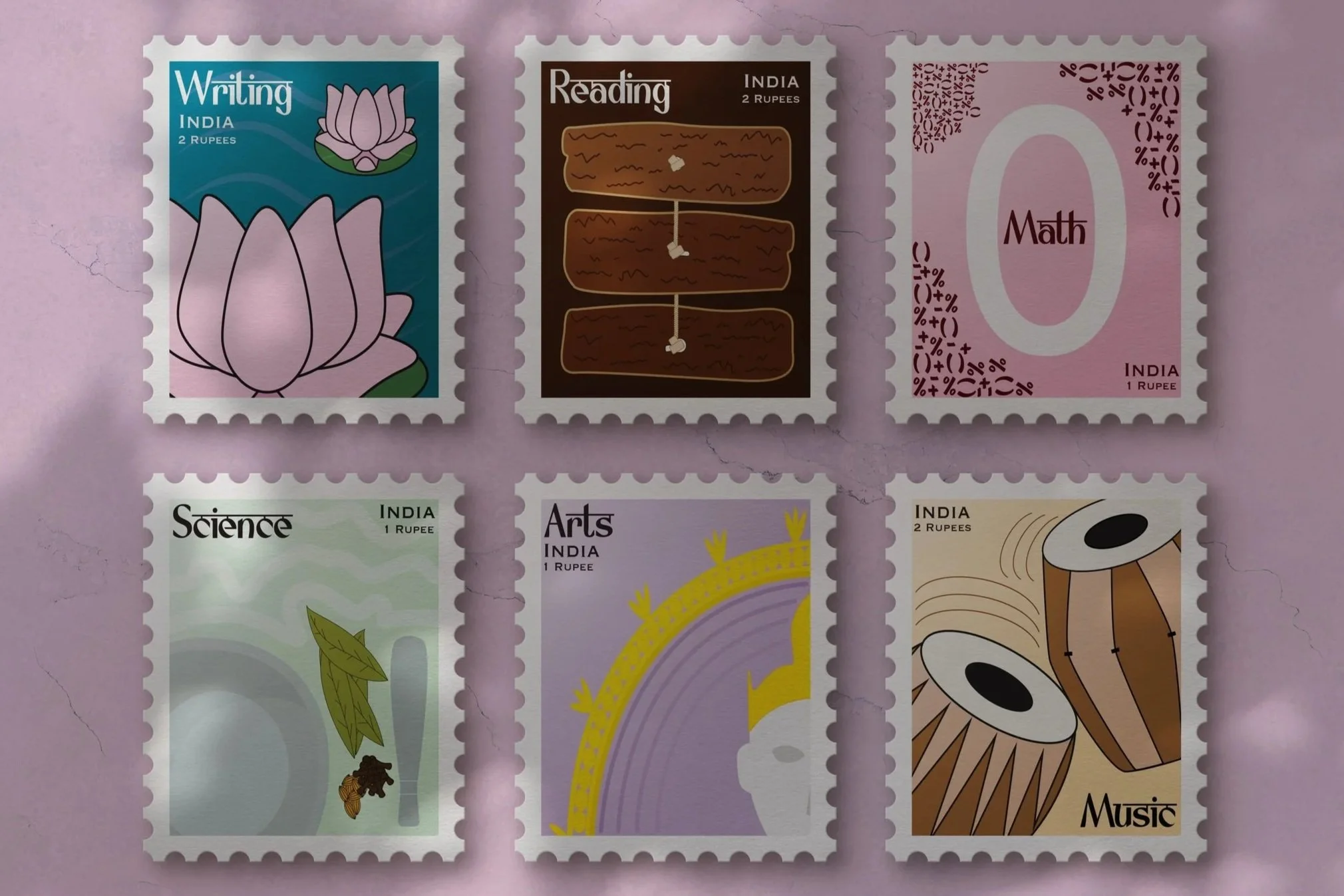
Celebration of Primary Education in India
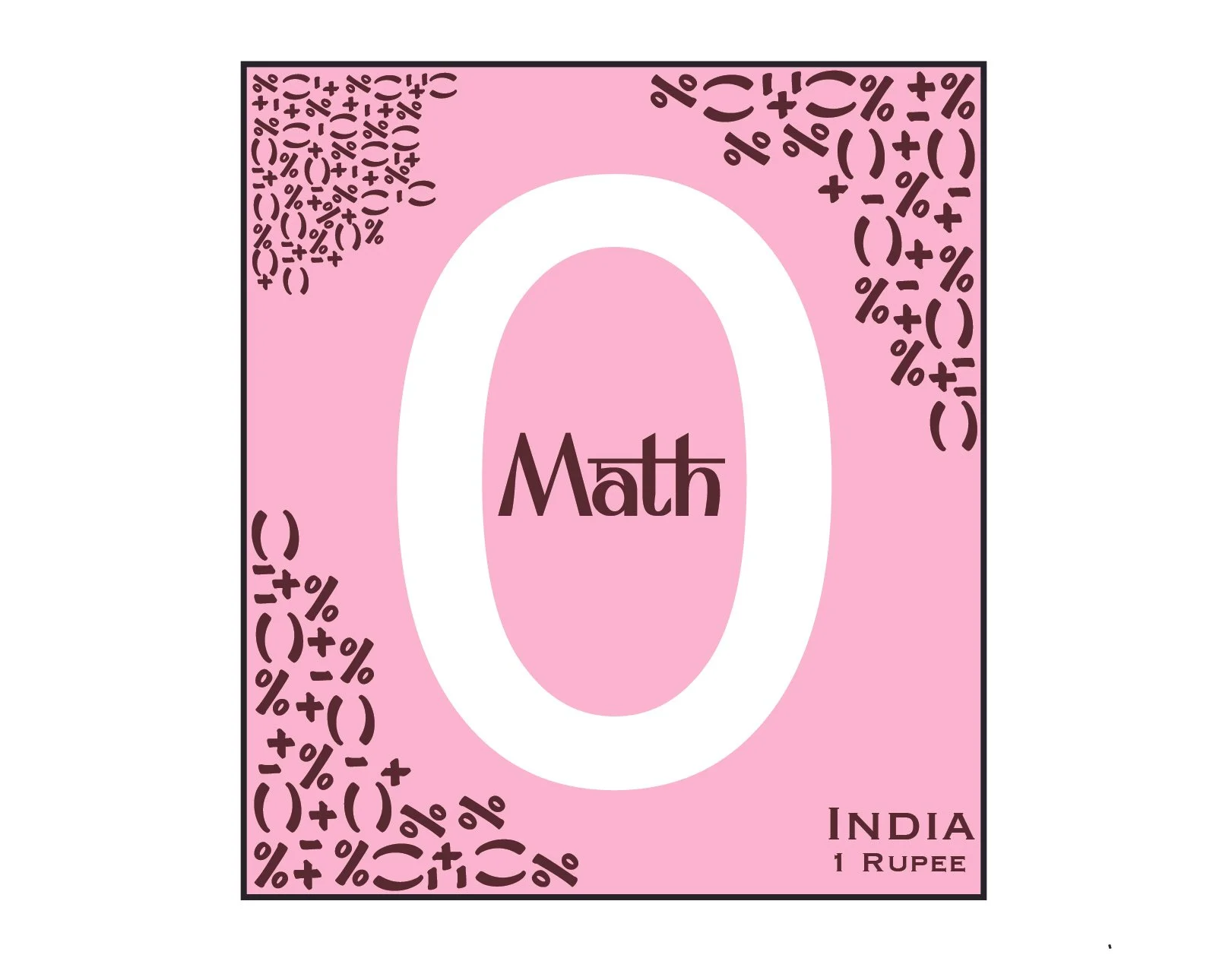
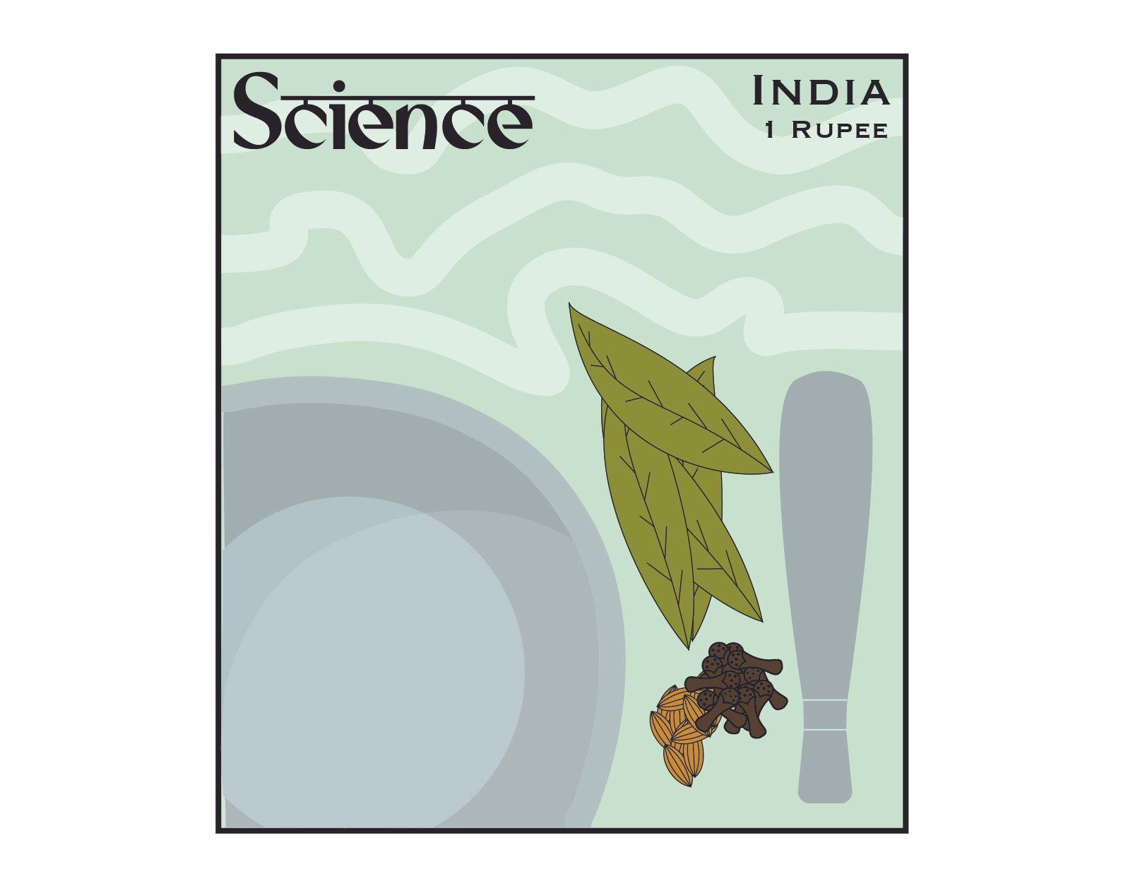
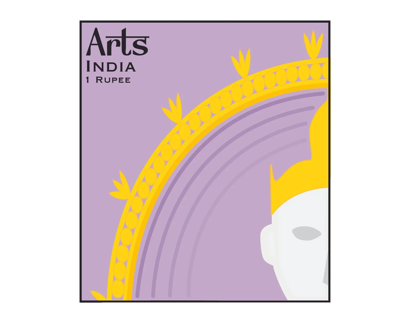
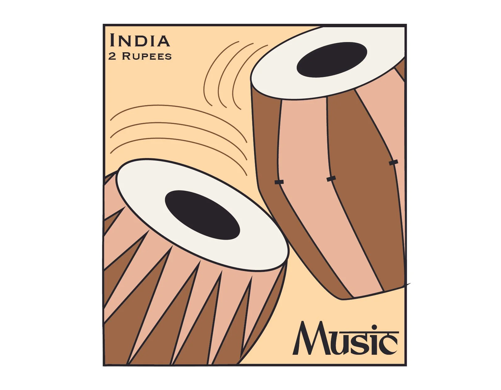
For this project, I chose to base my stamps on Indian and Hindu inspired symbolisms (using Adobe Illustrator).
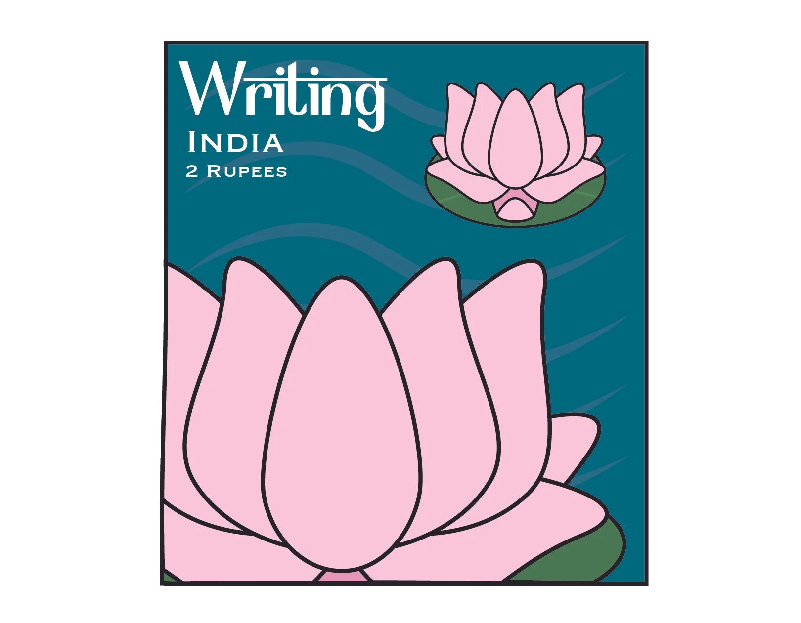
A lot of my “arts” related stamps are inspired by the Goddess Vidya Laxmi/Lakshmi as she is the Goddess of knowledge, wisdom, and education. The Lotus, her primary symbol, was chosen to represent writing as the first half of her name translates to “Knowledge” from Sanskrit, a sacred language in Hinduism. Her name itself shows the rich history of the Sanskrit language, thus, the lotus itself represents her. For reading I chose another symbol of Laxmi, which is an ancient form of scripture she holds in her left hand. They are thin pieces of wood which have writing carved into them. For math, I chose the number 0 as it originated from India. For science, I chose herbal medicine since it’s an ancient technique that is still practiced to this day for treatment. For Arts, I chose the God Natraj as he is the God of dance. Lastly, for Music I chose traditional instruments called “tabla” which have been used historically, and still present in modern day music.

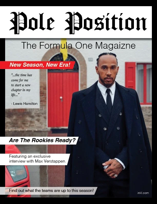
Mock Magazine
This project required students to create one cover and three spreads of a mock magazine on a topic of their choosing (using Adobe InDesign).
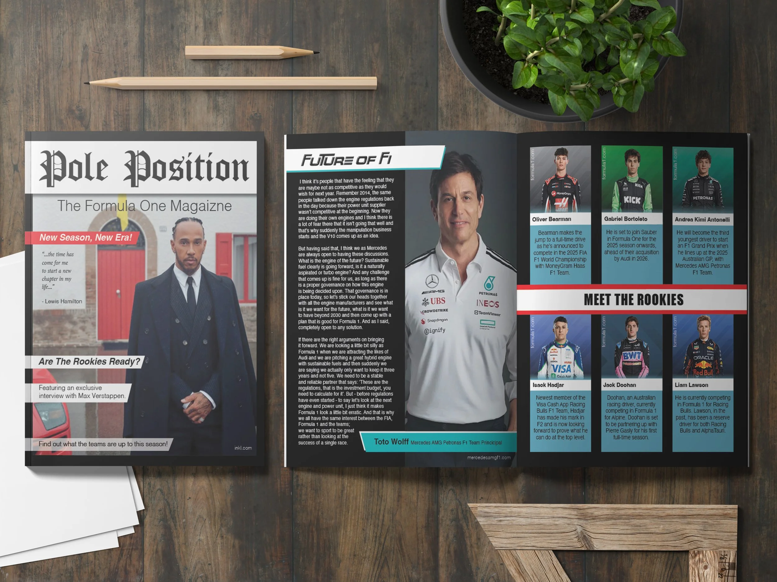
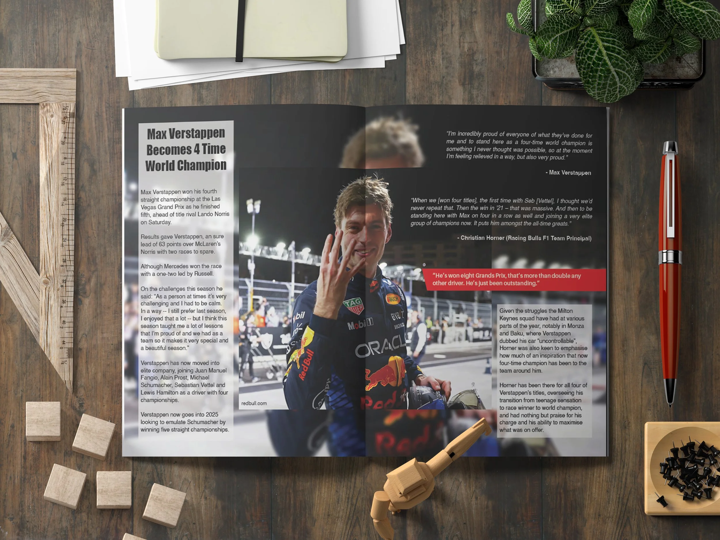
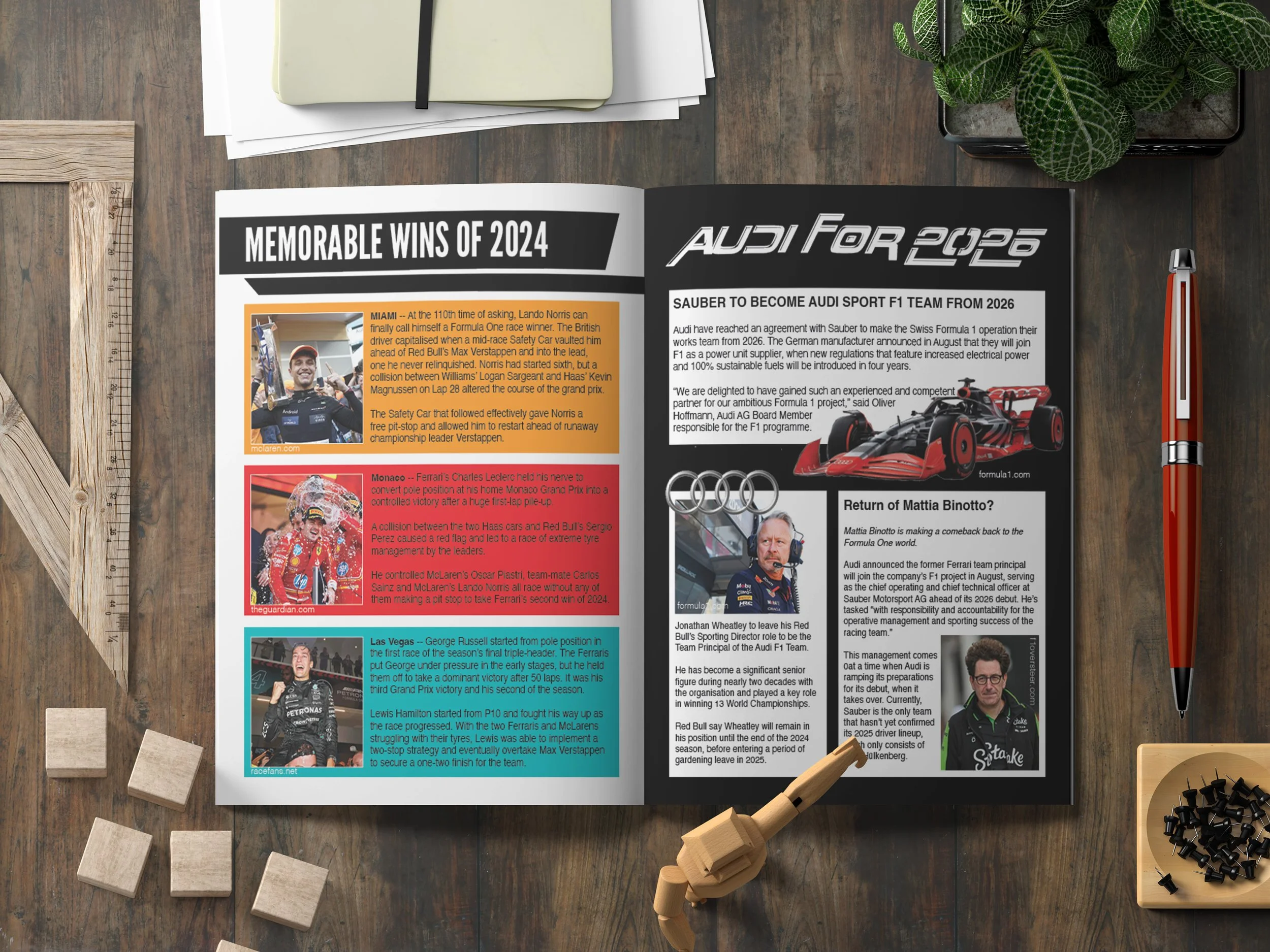
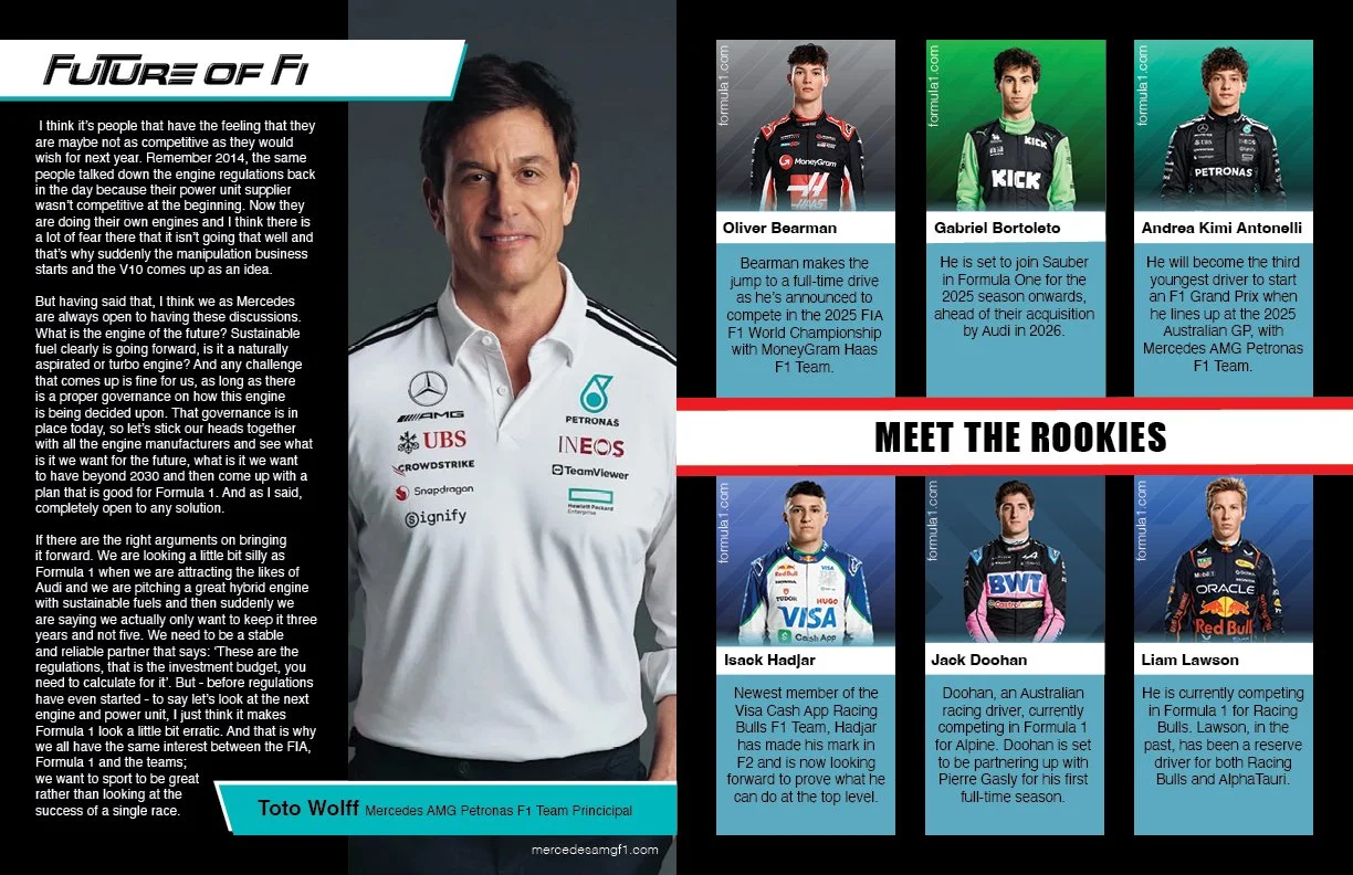
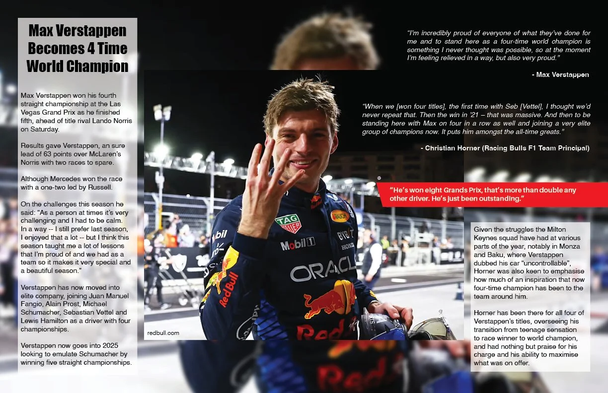
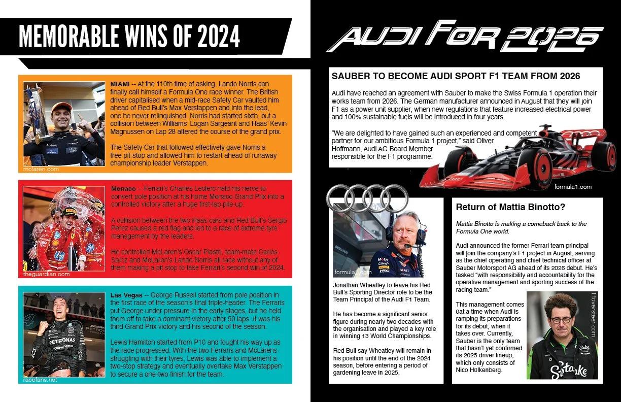
Usually when approaching prjects such as these I tend to lean towards fashion related topics, but I wanted to challende myself by creating a sport related magazine. When thinking of sports magazines they typically have a certain bold, rigid, and “masculine” look to them — which is an aesthetic I haven’t allowed myself to explore.
A sport that I really enjoy watching is Formula One (F1), so, I decided to base my magazine on this topic and keep it relevant to current and major events.
Coming up with a color palette was very easy as F1 likes to stick with red as their primary color, and to build off of that I also included blue in palette to help create a contrast. I then proceeded to included black and white as the neutral colors.
Similar to the color palette, I wanted to continue the theme of boldness for the fonts which is why I mainly utilized sans serif fonts.
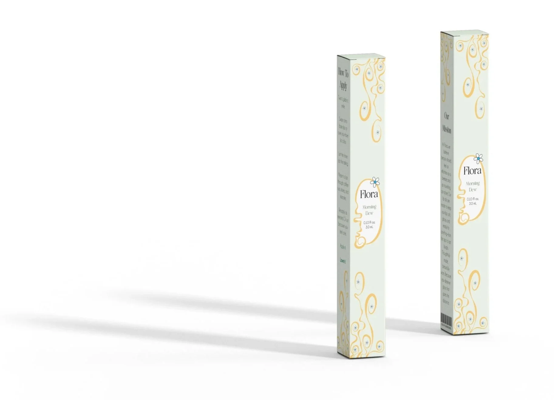
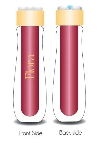
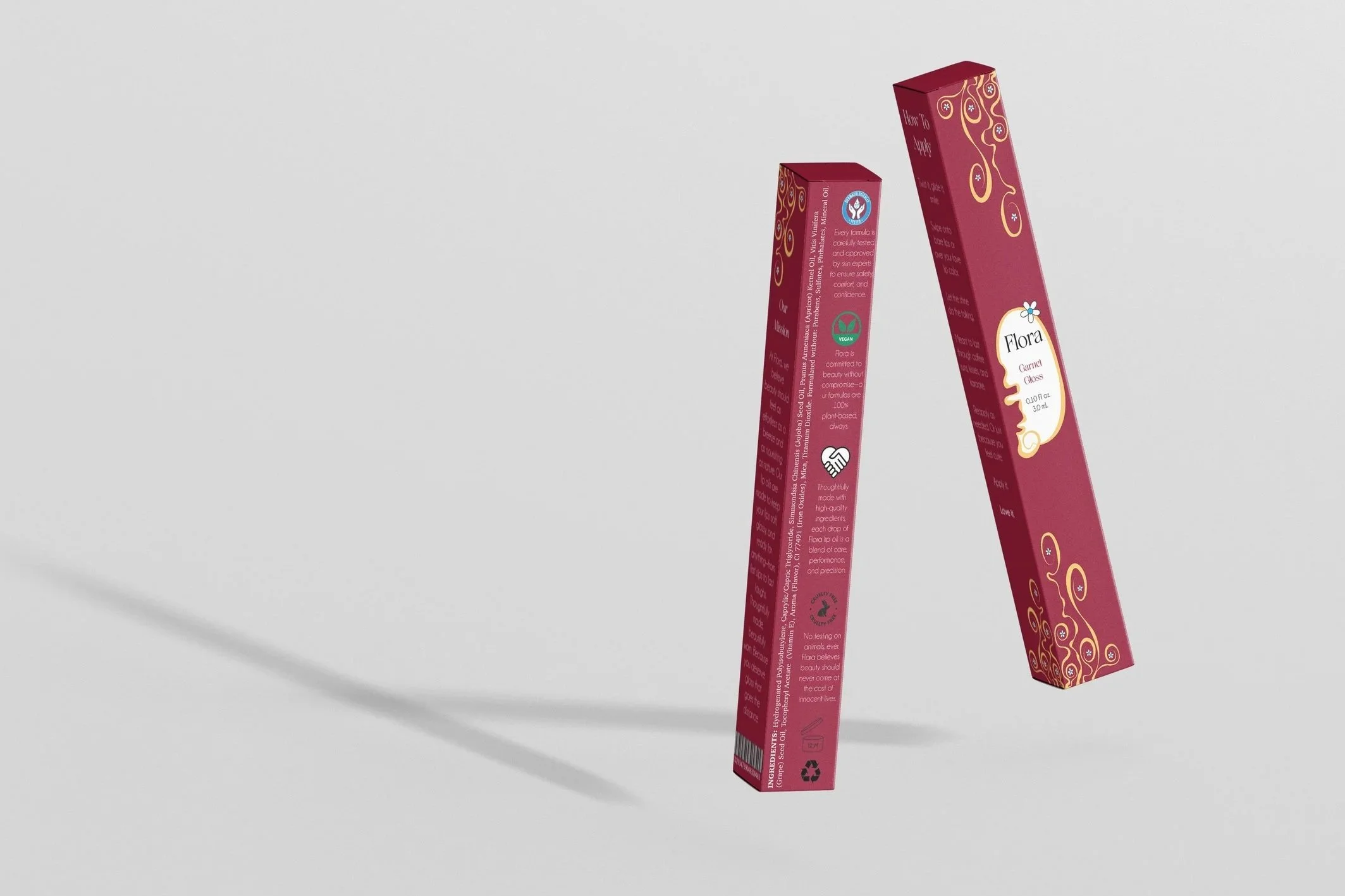
Mock Product
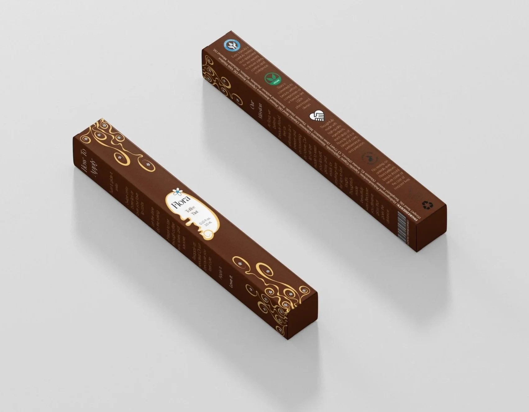
This project gave students the creative freedom to either re-design the packaging of a pre-existing product, or create a completly new product. I chose to create a new product design that could be used as a lip oil or lip gloss.
When creating my initial sketches, I focused more on how the lip oil/gloss tube would look rather than the actual packaging. In my sketches I really liked the design I created focusing around a flower, so for the final packaging I included that design as a way to have consistency and cohesiveness in the product’s look.
With the use of Adobe Illustrator, I began my final version based around the flower design — which also inspired the brand name “Flora”. I initially only had one package design, but to provide more range and make it more convicing as a brand I created two more packages with the same texts and dimensions but different colors to show a line of products.

Typographic Posters

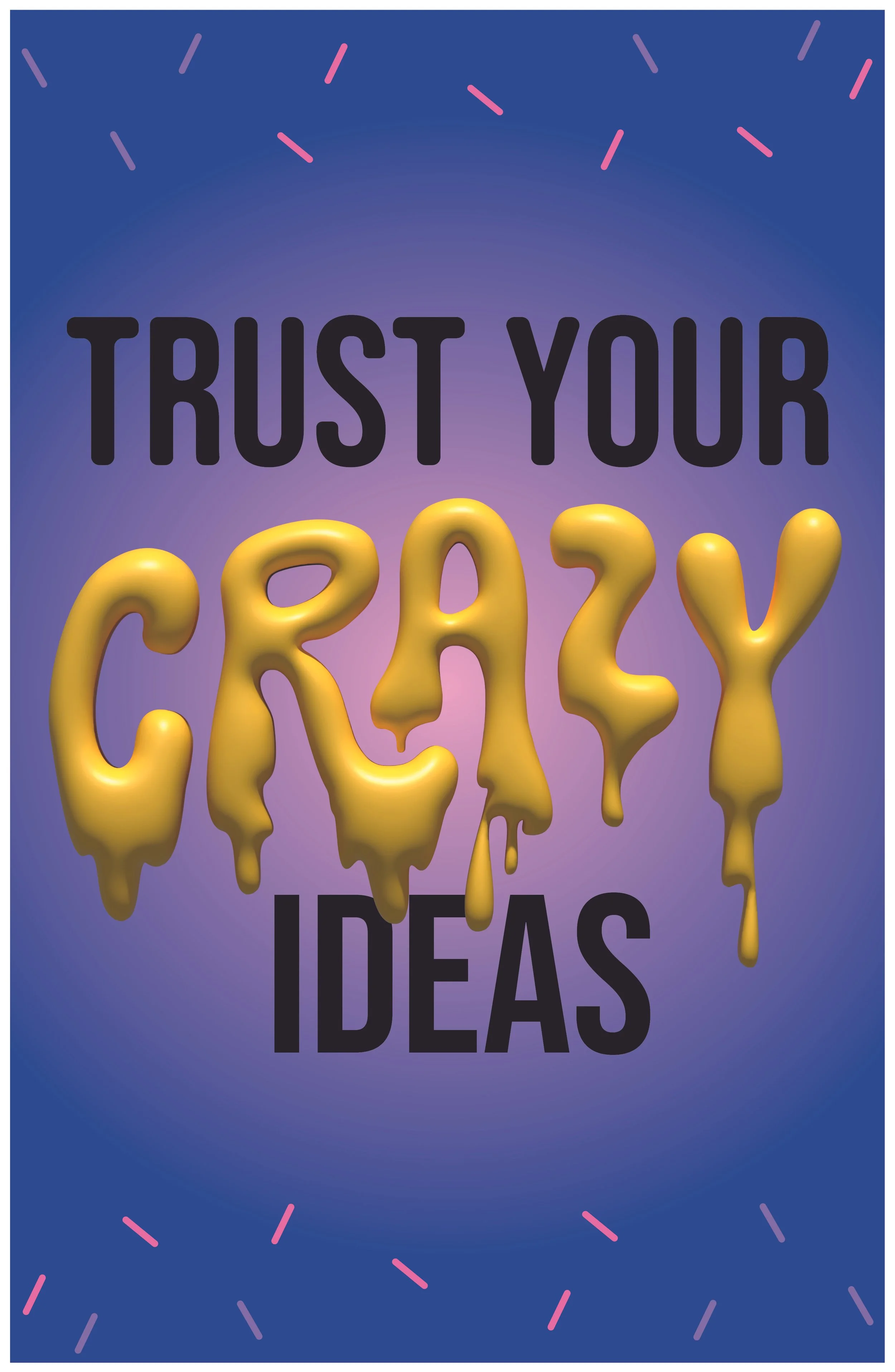
Using Adobe Illustrator I explored typography as a powerful visual tool to communicate messages of reassurance, affirmation, empathy, and support.
The goal was to design a typographic poster that fosters a sense of community and belonging by addressing mental health and social justice awareness on campus.
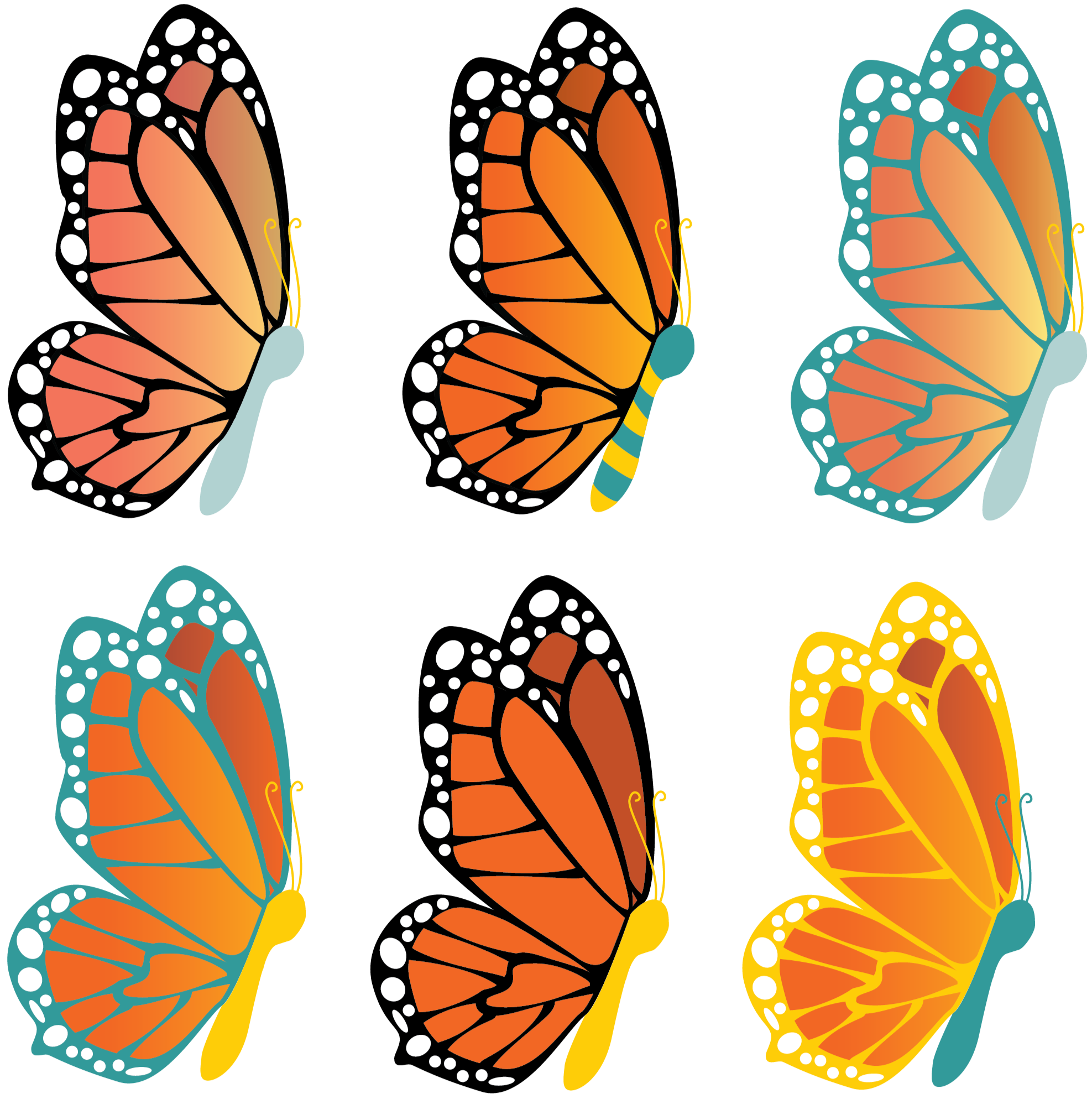
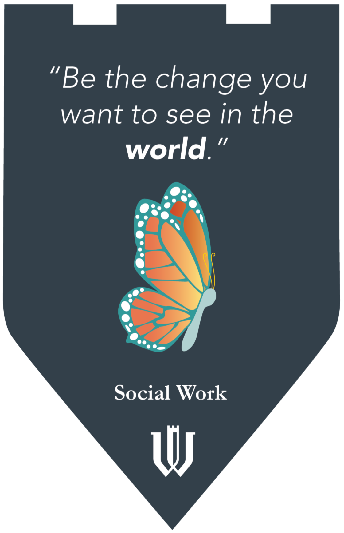
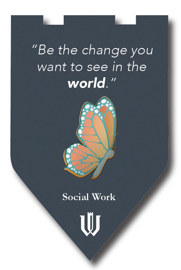
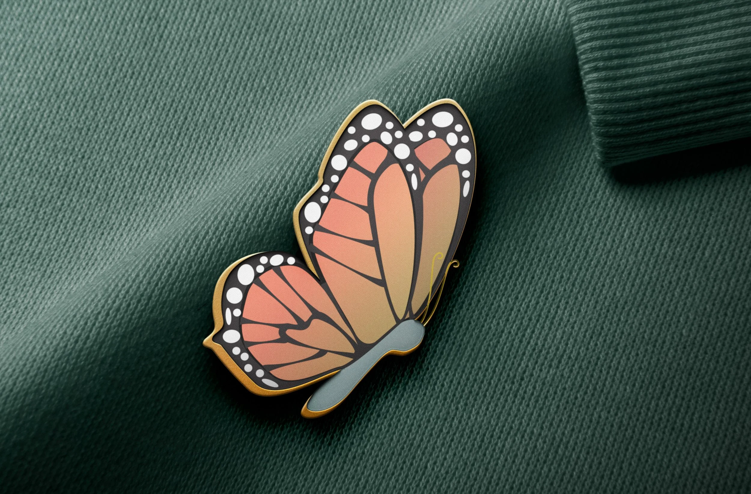
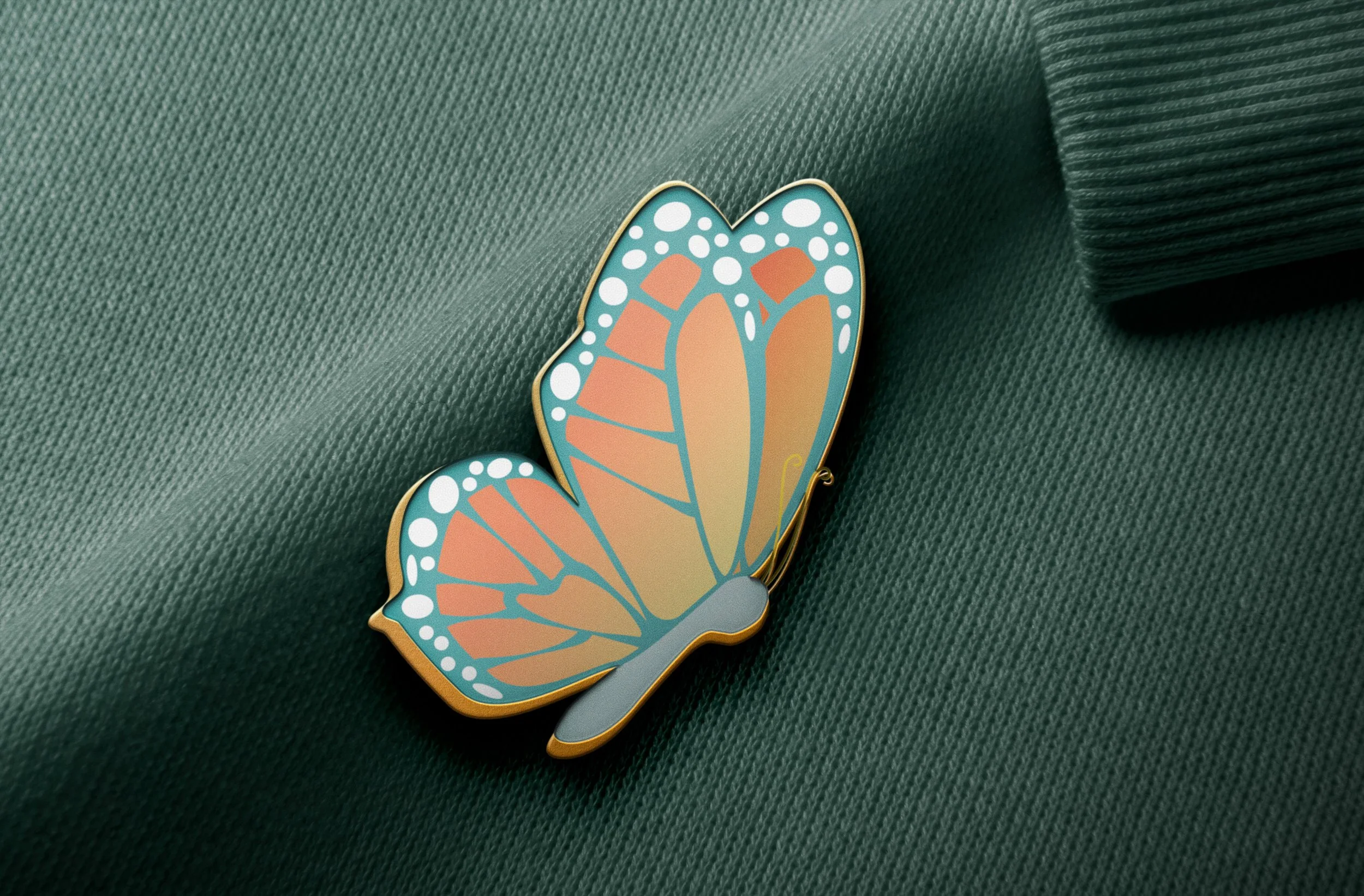
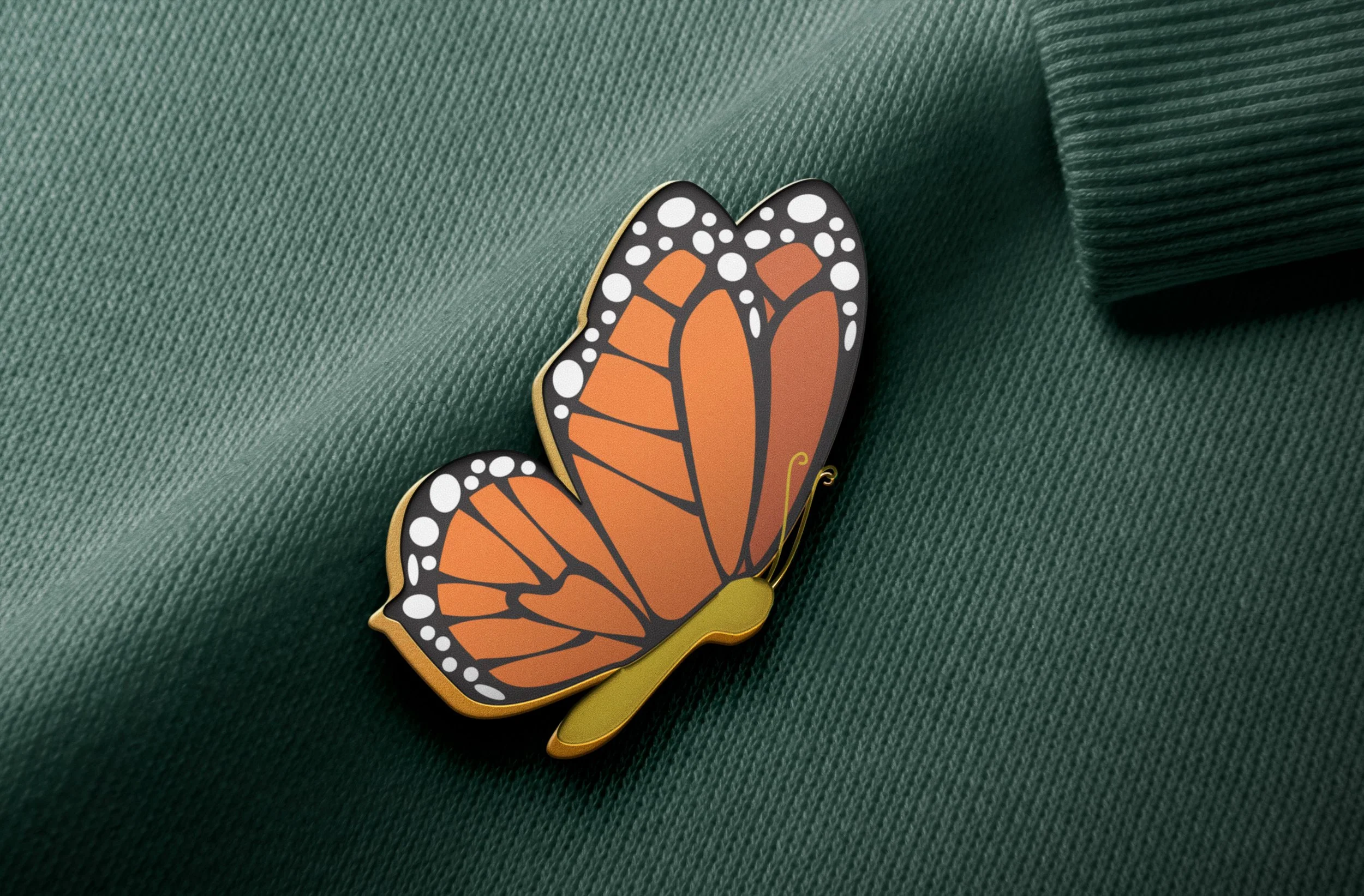
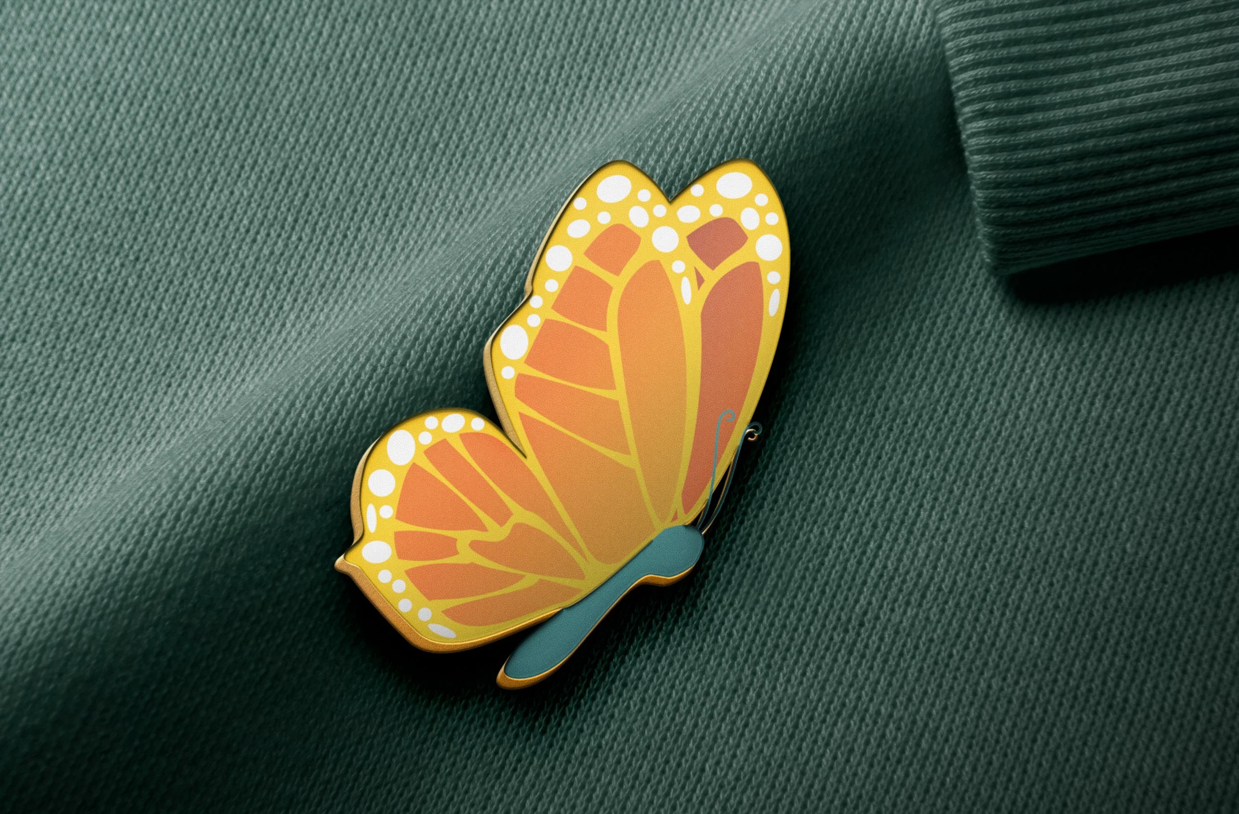
Pin Designs
The Social Work Department at Warburg College wanted to develop a cohesive visual identity that represents growth, transformation, and professional development. What better way to do this then by using a butterfly as a symbol for this?
As this was for the Wartburg college I decided to utilize Wartburg’s primary and secondary colors for most of the designs. I still created options with more traditional monarch butterly colors in order to give the client more options.
I also created a pin back-up for the client, meaning once the pin was completed it could be handed to the students attached to a tough paper material. The pin back-up has the quote “Be the change you want to see in the world” as requested by the client, alongside the department’s name and college logo. For this project I utilised Adobe Illustrator.